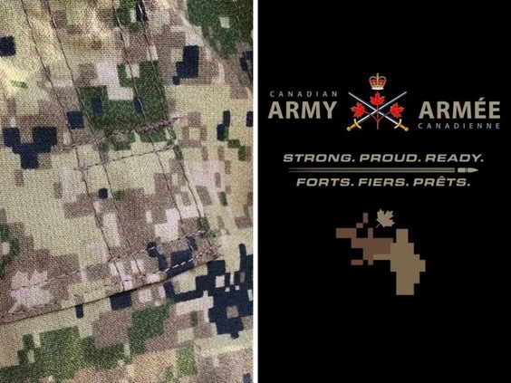
A new Canadian Army logo, which quickly became the subject of intense online backlash, was approved at the highest levels without any objections, despite the image being later compared to a bear engaging in inappropriate activity with a moose.
The approval process for the logo began in March 2024, with plans to launch the new design online by May, according to documents obtained by the Ottawa Citizen. However, once unveiled, the logo—a tilted maple leaf over a pixelated camouflage pattern—was met with immediate mockery and criticism.
Social media users expressed outrage, with some accusing the army of changing its official emblem. Others made comparisons between the logo and an image resembling a man or a bear inappropriately interacting with a moose. The logo also inspired memes likening it to a pile of feces or pixel art from the game Minecraft.
The backlash led National Defence to issue an apology for the confusion, clarifying that the new logo was not intended to replace the Army’s official emblem but was rather a supplementary design.
Army documents obtained through the Access to Information law reveal that the logo was meticulously planned and approved by military leadership. The process began on March 21 with the deputy army commander and involved discussions among army public affairs officers, followed by a briefing on April 12 for senior army leaders. No objections were raised during this time.
The rollout documents indicated that the logo should only be used in specific ways, with instructions that the icon should not be flipped horizontally or vertically, though no explanation was provided for this directive.
The image was designed to highlight the colors in the Army’s new camouflage pattern, specifically resembling the pixels in shades of brown, topped by a maple leaf.
The social media uproar was immediate after the Army posted its new logo on May 3. In addition to the sexual references, much of the commentary centered on confusion over what the imagery was supposed to represent. One commentator wrote on X, formerly known as Twitter, “Looks like something I wipe off my windshield while pumping gas.”
Questions also arose about who was responsible for the design and approval of the logo, with some suggesting that those involved should be fired. Conservative MPs accused the Liberal government of imposing the new imagery on the Army. However, the documents confirmed that the logo was an initiative developed internally by the Army.
National Defence spokesman Alex Tétreault confirmed that the new logo is in use and explained that it would appear in the bottom left corner of various internal and external materials, as well as in video animation and social media content.
The icon was part of a broader Army branding and communications strategy aimed at establishing and maintaining credibility, as noted by the then-Army commander Lt. Gen. Jocelyn Paul in the service’s new public affairs strategy released in May. Paul has since retired.
Tétreault stated that no follow-up report was produced to assess what went right or wrong with the logo’s rollout or to analyze the social media backlash.
However, retired senior military public affairs officer Col. Brett Boudreau criticized this approach, stating that failing to conduct a lessons-learned analysis was a “failure of professional responsibility” and warned that it could lead to repeated mistakes in future initiatives. He concluded that while the new logo initiative was likely well-intentioned, it ultimately failed.
Tétreault noted that the imagery was developed by the department’s internal graphic design team at no additional cost to taxpayers.


